Tuesday 24 October 2006
Partial Ligatures
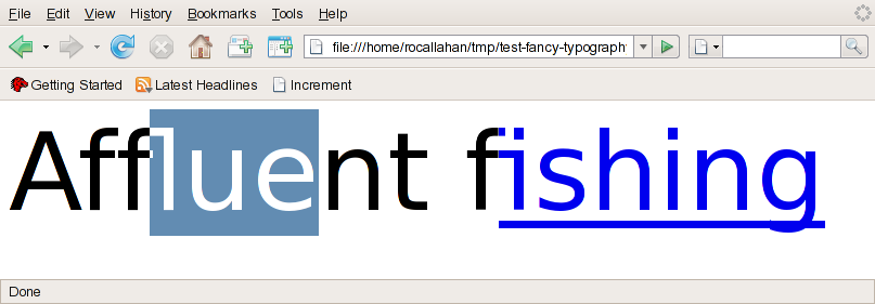
The screenshot shows some text in DejaVu Sans using my text code and Pango 1.14. "fl" and "fi" are being rendered as ligatures. I'm selecting inside "fl" to show how that works. Basically it's a hack --- a ligature with N characters is divided into N vertical strips of equal width which I pretend are "pseudocharacters", and then I use clipping to draw the individual pseudocharacters. This seems to work OK.
The screenshot also shows another feature of the new text code: our text layout objects (gfxTextRuns) can span DOM node boundaries. In this example the textrun spans the boundary of an <a> element. This enables us to form ligatures across those boundaries but thanks to partial ligature support, we can still style the link element correctly. Not just ligatures but also kerning and shaping benefit from cross-node text layout.
Note: When I said above that any substring should be selectable, that was a lie. Multiple Unicode characters can combine to form "clusters", for example a character with an accent, and selection should always be restricted to cluster boundaries. More consistent support for honouring cluster boundaries is another feature of the new text code. However, I currently don't support clusters spanning DOM node boundaries, because we really have no way to render those, not even a hack.
By the way, I noticed the hairline crack in the fi ligature. It's probably a rounding error that I need to track down.
Comments
Um ... What if it's not "fi" but "Wi"?
It seems that the work you are doing should be used where ever text is displayed.
Or maybe we need a better font definition, and stop using one glyf for two letters?
monk.e.boy
By "standard" I mean guidelines that typesetters and graphics designers use when they layout type in magazines or similar manually.
My thinking is that if there is a font size difference, I assume the ligature would be broken apart into the separate characters. So is font size then a special case or just another type of formatting (along with color and decoration, for example)?
I can see how these "pseudocharacters" are necessary for selection, but should they be used for formatting as well, or should the ligature glyps be replaced by the separate characters and formatting be applied to those?
I guess I'm just curious of the rationale behind the technique presented in this post.
(Is a "font" technically not just the font face but the font size as well, perhaps? Arial 12pt and Arial 13pt are two different "fonts" from the layout perspective, even though the basic font face is the same.)
Anonymous: I don't know if there's a better strategy. Pango does what I'm doing. I'm not aware of any OpenType font data that would help us do anything smarter. The good news is that if someone *does* come up with a better strategy on some platform, it can be incorporated into the gfxTextRun implementation without changing any interfaces.
We allow textruns to combine whenever there's adjacent text with the same font and size. One reason this is a good idea is that changing other attributes of text, such as its color, *should not* change its layout, from the user's perspective. (Imagine if you're using the HTML editor.) Even more so if you're doing something with no other visible effect, such as breaking a text node into several spans so you can set non-presentational XML attributes on the spans.
Chris: I'm not sure what you mean by "cursor positions for selection". Pango converts character indices to coordinates using the same ligature-breakup strategy as I'm doing here. We do call pango_break to find cluster boundaries via is_cursor_position, just as your existing code does.
Compared to your Pango nsFontMetrics code, this code doesn't provide much new functionality except for text runs spanning DOM nodes (which is actually pretty huge from an implementation point of view). It's more a refactoring to redesign everything around a richer abstraction that fits better with Pango/Uniscribe etc, so we no longer have to grapple with a bazillion poorly-tested code paths in nsTextFrame. And probably more importantly, gfxTextRuns persist so we can (and do) cache shaped glyphs and their geometry, and the gfxTextRun APIs push expensive operations (such as "find where to break this text") down into per-platform textrun code for maximum optimization possibilities. The performance of your Pango code was never very good, at SuSE we had to disable it for most locales.
I can fully understand non-presentational XML attributes on spans not affecting the visual aspects of the layout.
My reasoning is that a ligature glyph is perhaps in itself is a character. It's a replacement for two characters that have some relation to eachother, yes, but when it comes to formatting it should perhaps be seen as a single character.
If the same formatting applies to both characters that make up the glyph, then there is no problem, but if the formattings of the two differ, it would be like trying to paint e.g. the letter A with half the one formatting, half the other.
It would have the ramifications you mention, for example "fi" not always being the same width depending on the formatting of "f" and "i" and therefore changing the layout.
I don't take issue with the way it's currently implemented in any way. I'm just curious, that's all.
There's a reference to it on this page: http://anakin.ncst.ernet.in/~aparna/consolidated/x1427.html
Screwtape: that is very interesting. I wonder if any fonts provide that data...
But I notice once thing, it's that the http://www.catch22.net/tuts/editor12.asp case is somehow still not correct even with the recent builds ?